
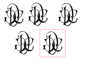
Wedding Logo
Our very first collaboration for the wedding was the logo. We talked about what we wanted to use, and I came up with a sketch, which George turned into a digital design. We used it throughout our stationery, and on the wedding favours, website, and thank you cards (we're writing them this weekend!).
 |  |

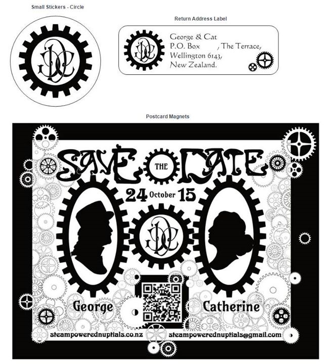
Save the Date
We decided to keep our Save the Date cards simple, so we used black and white. We printed them on magnetic postcards, and encouraged people to visit our website for more information.
George designed all the cogs, and I brought them together, with the cameo portraits that I had drawn.
George designed all the cogs, and I brought them together, with the cameo portraits that I had drawn.
Invitations
I got stuck for quite a while on the invitation artwork and layout, because I had fixated on an Art-Nouveau-meets-Steampunk concept. My initial sketches were good, but not great, and I couldn't get them to coalesce into a proper layout - it ended up looking more like a colouring book page than an invitation to a wedding.
Back to the drawing-board... At this point, I had come up with the concept for the website artwork, so after establishing a trial layout for the text, I tried to incorporate the characters in the invitation design... but that didn't really work either - until I decided to use the background artwork, instead, and suddenly, it all came together.
Along with the invitation itself, we also included a wallet card with the basic details (and a ticket-style design), and RSVP card (although we encouraged online replies), and a fridge magnet as a reminder. We really wanted to 3D print a wax seal, but we had to prioritise other tasks because of technical difficulties with the printer. Amusingly, I brought out my wax seal, a souvenir from Orvieto in 2003, and we realised that my maiden initials (CG) were the same as our first names, so we went with that instead - and it was lovely. The best thing was that the seals survived all the way to the USA!
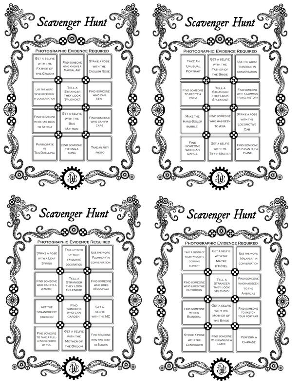
Scavenger Hunt
In case our guests were bored or struggled to chat and mingle on the bus trip, I created Bingo-style Scavenger Hunt cards for them to use (although apparently, some of the older guests couldn't read them). The good news was that they were not actually needed, as the guests all got on really well and had a great time, but it was good to know that they existed. The challenges I chose encouraged interaction with each other, but also with the different venues, and the activities that we had arranged there (for example, spotting leaf springs or the Gumdigger carriage at the ceremony venue, or participating in the Tea Duelling at the reception.
Programmes
As anyone who has watched an awards show will know, acknowledgements can be long-winded and boring for the audience, and nerve-racking for the speaker. What if we forget the most important or most obvious person? What if we get too worked up or emotional to finish the speech? I didn't want to forget anyone, so I made sure that the acknowledgements were printed on the back of the programme, as well as asking the MC to cover them off in the speeches. We decided to echo the theatricality of one of our original thoughts by making the programme a playbill for the ceremony, which was very much a performance, although luckily without any 'alarums' or 'excursions'. I used a few railroad-inspired phrases, particularly related to railway couplings (being the most apt imagery for a railside wedding).
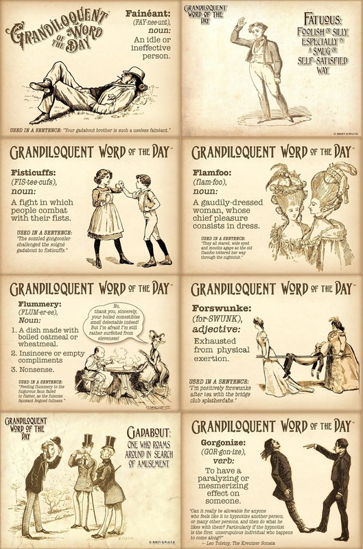
Placecards
For the placecards, I used the entertaining and informative word posts from Grandiloquent Word of the Day.
Pro-tip - if you have changes in your guest list (and who doesn't!) - double-check the you have deleted the right name from the list! I accidentally removed the wrong name, but I deliberately brought extra blank cards (remember scissors and a pen!), so the day was saved... although we did have to cut the paper out with a blunt knife, and write the name with a pencil :/ It looked very....rustic.
 Seating Plan | 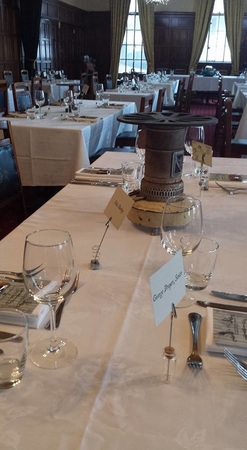 |
We were lucky enough to have the space to seat our guests in small tables of 4, which made for good conversation and lots of space for each person - another advantage of a small guest list!
We made the seating plan out of two black canvases, which we hinged together. The 'tables' are little square pieces of mirror and adhesive letters, and as with many of the other small craft supplies, we got most of these bits from our amazing local discount/clearance store, Pete's Emporium. The little tags that I designed and printed are attached with glue dots to miniature wooden pegs, which are themselves glued to the backs of the mirror squares. For the wording, I used black Scrabble tiles from Sun and Moon Craft Kits.
We made the seating plan out of two black canvases, which we hinged together. The 'tables' are little square pieces of mirror and adhesive letters, and as with many of the other small craft supplies, we got most of these bits from our amazing local discount/clearance store, Pete's Emporium. The little tags that I designed and printed are attached with glue dots to miniature wooden pegs, which are themselves glued to the backs of the mirror squares. For the wording, I used black Scrabble tiles from Sun and Moon Craft Kits.
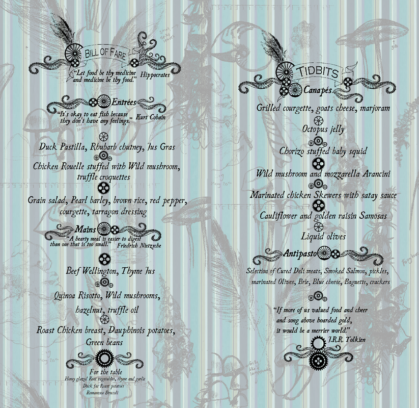
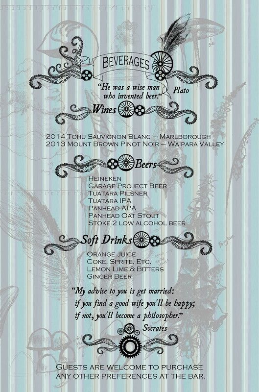
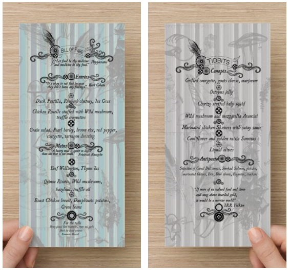
Menus and Beverage Cards
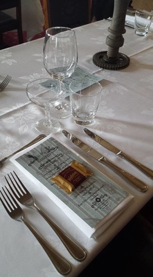
The menu was provided by the chef at the Wellesley, in consultation with us. The cards were designed by me, and printed by Vistaprint.
 RSS Feed
